When designing a product label, you should cover every detail to ensure that you have the best label possible for marketing your product. Typography is a major component of a product label. This aspect is this vital for communicating all necessary information about the product. But it’s also crucial for drawing their interest and building your brand. Read ahead to learn some tips for choosing label typography.
Understand the Best Fonts for Certain Products
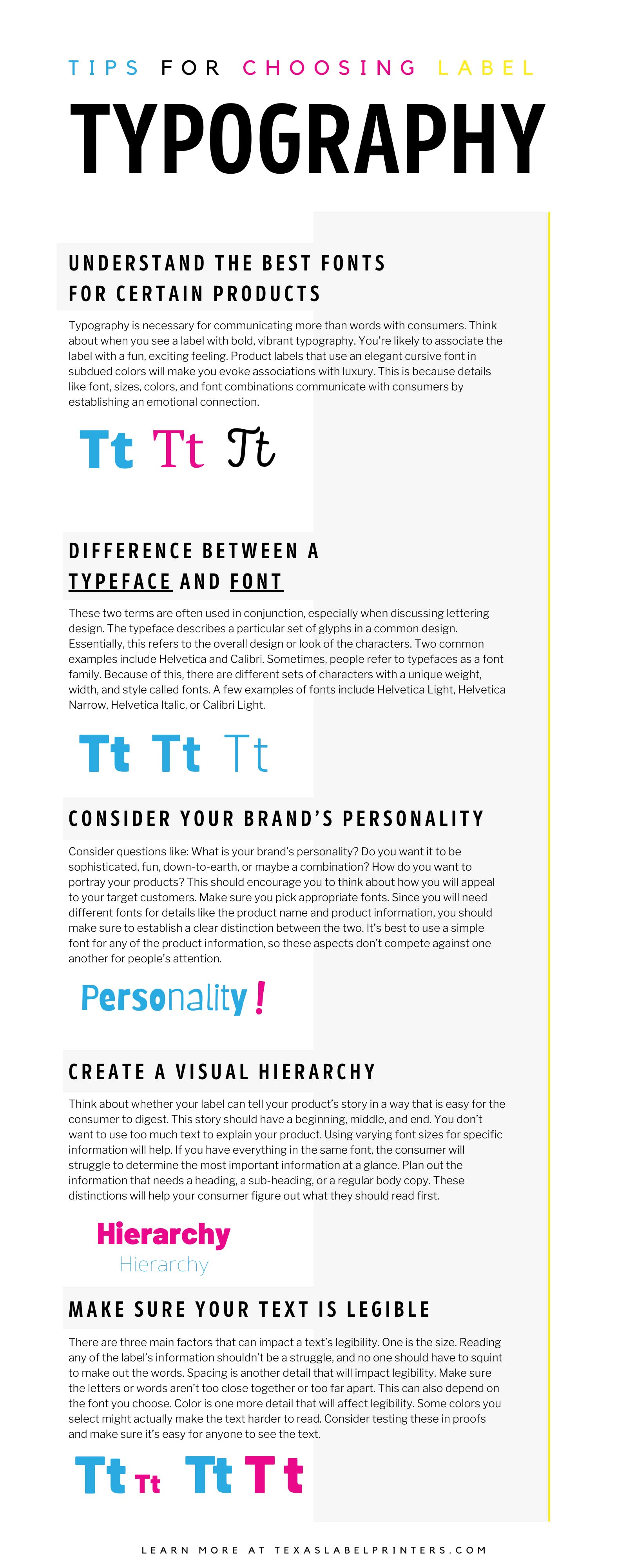
When it comes to product labels, there are several ways that letter fonts can contribute to the success of your product. Typography is necessary for communicating more than words with consumers. Think about when you see a label with bold, vibrant typography. You’re likely to associate the label with a fun, exciting feeling. Product labels that use an elegant cursive font in subdued colors will make you evoke associations with luxury. This is because details like font, sizes, colors, and font combinations communicate with consumers by establishing an emotional connection. You want to start by thinking hard about your product. What exactly is the product? Who is your target demographic? These questions will dictate the kind of typography you choose. While these details are important to consider, your text still needs to convey your product’s message and information clearly.
Difference Between a Typeface and Font
You should understand the difference between typeface and font. These two terms are often used in conjunction, especially when discussing lettering design. The typeface describes a particular set of glyphs in a common design. Essentially, this refers to the overall design or look of the characters. Two common examples include Helvetica and Calibri. Sometimes, people refer to typefaces as a font family. Because of this, there are different sets of characters with a unique weight, width, and style called fonts. A few examples of fonts include Helvetica Light, Helvetica Narrow, Helvetica Italic, or Calibri Light. It’s also important to note that there are different categories of typefaces. Serif typefaces are characterized by the small stroke or line present at the end of the letters, referred to as a serif. The next category is known as sans-serif, which contains characters without the serif. Script typefaces appear as if they are handwritten. Its elegant style makes it a common choice for high-end labels, like the kinds you see on wine bottles or luxury items. Lastly, there are display typefaces which are often used for headlines since they feature a wide variety of character styles.
Consider Your Brand’s Personality
We talked briefly about your product and your target demographic. This gets covered more in-depth when talking about brand image. Consider questions like: What is your brand’s personality? Do you want it to be sophisticated, fun, down-to-earth, or maybe a combination? How do you want to portray your products? This should encourage you to think about how you will appeal to your target customers. Make sure you pick appropriate fonts. Since you will need different fonts for details like the product name and product information, you should make sure to establish a clear distinction between the two. It’s best to use a simple font for any of the product information, so these aspects don’t compete against one another for people’s attention. Don’t forget to make sure it’s legible and meets the product’s regulatory standards. You don’t want to risk having to recall your product because you violated a rule set by the FDA—this can seriously harm your brand’s reputation. Don’t forget to test your label fonts with the graphics you’ve chosen. Everything needs to work together to make a successful product label.
Create a Visual Hierarchy
Another of our tips for choosing label typography is to create a visual hierarchy. The fonts and typeface you choose are a significant detail. But you should also consider further aspects. Think about whether your label can tell your product’s story in a way that is easy for the consumer to digest. This story should have a beginning, middle, and end. You don’t want to use too much text to explain your product. Using varying font sizes for specific information will help. If you have everything in the same font, the consumer will struggle to determine the most important information at a glance. Plan out the information that needs a heading, a sub-heading, or a regular body copy. These distinctions will help your consumer figure out what they should read first. You can continue to vary each line’s design to ensure the consumer’s eye follows the specific order of information.
Make Sure Your Text Is Legible
One of the biggest yet simplest mistakes you can make is using illegible text. If you make your text hard to read, the consumers will get frustrated or they simply won’t trust the product, making them less likely to buy it. There are three main factors that can impact a text’s legibility. One is the size. You don’t want to end up with text that is so small that your audience can’t read it. Reading any of the label’s information shouldn’t be a struggle, and no one should have to squint to make out the words. You also shouldn’t make the text too large, as it runs the risk of overwhelming your design. You may need to print out a proof to make sure the text comes out at a legible size, since some will look clearer on a computer screen compared to their final printed form. Spacing is another detail that will impact legibility. Make sure the letters or words aren’t too close together or too far apart. This can also depend on the font you choose. Color is one more detail that will affect legibility. Some colors you select might actually make the text harder to read. Consider testing these in proofs and make sure it’s easy for anyone to see the text.
Ensure that you get the best quality product labels by choosing Texas Label Printers. Here, you can find a digital label printer from a wide selection of the best manufacturers in the industry. For more information, contact us today!