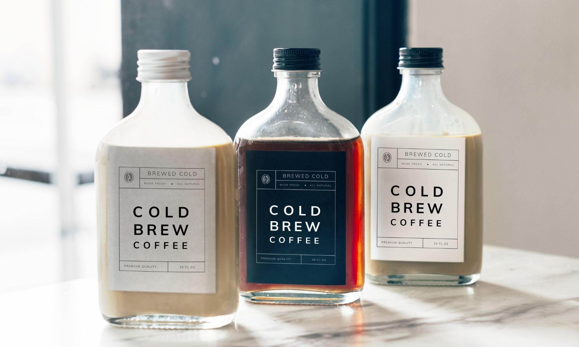
Product packaging is one of the most consumer-facing aspects of product development. Manufacturers should treat the process with extreme care and attention to detail. When designing a product label, many aspects need to be taken into consideration. The colors, images, and copy used on the product label must all work together to create an informative and appealing design. While certain industries do require the inclusion of specific information on their product labels, most still follow a general set of design guidelines. This guide explores several of those guidelines as well as the most important characteristics of a well-designed label.
Cohesive
As we’ve stated, the color, imagery, and font used in a product label must all work together to achieve a cohesive design. Maintaining a consistent and cohesive design throughout the product label is important on several levels. First, it creates a design that is appealing to the eye without overwhelming the senses. Second, it ensures that the product remains consistent with all other elements of the company’s marketing strategy. Elements included on the product label should complement or directly reflect other stylistic choices used in the company’s marketing efforts. This consistency helps further the company’s brand identity, making all products from the company instantly recognizable from the retail shelf.
Simple
One of the most important characteristics of a well-designed label is simplicity. This is not to say that you cannot include vibrant colors and imagery on your product label but that you should be sure not to overwhelm your customers with too many different style elements at once. Overloading your product label with an abundance of different colors, images, and font styles can cause customers to lose sight of the most important parts of the label. Including too much information on the product label results in the same confusion and may cause customers to forgo your product in search of something more straightforward. When designing your product label, try to incorporate one or two big elements, perhaps a vibrant color combination or the inclusion of a company mascot. Limiting yourself in this manner will ensure that your product label maintains its simplicity and provides customers with the necessary information without overwhelming them.
Eye Catching
Above all else, a product label must be appealing to the eye. After all, it is the label that entices the customer to pick up and eventually purchase the product. When attempting to design an eye-catching label, be sure to consider which colors and images stand out the most on a retail shelf. Utilize color combinations, imagery, and fonts that are different from that of your competitors, as this will help set your products apart. Such design elements should be printed clearly on the label and should stand out in vivid color and clarity. Utilizing color label printing equipment will ensure that your images appear crisp and achieve the intended effect every time.


