Designing safer labels for medications has become an essential need in a world where the volume of prescription medications has continued to increase. This increase has had various effects on society, and one of the most troubling is a lack of fully understanding the instructions on medication labels. Patients need to be able to understand the instructions on their medication’s label, as this is vital for safe medication use. There are further concerns with supplementary medication information, such as leaflets that come with each prescription. While these leaflets contain all the information about the medication, they are far too long and written in complicated jargon that is too difficult for many patients to absorb. For this reason, the patent often refers to only the label on the medication container to learn the information they need. Therefore, medication labels must be held to certain standards of practical design that can convey all the necessary information for the user to follow. What will this involve? We can answer that here with this list of design tips for a safer medication label.
Improve Its Readability
Clear readability of the medication label’s design is one of the first details that will make it safer. If the patient cannot read the label easily, they are likely to misunderstand details in the directions, which will lead to them not following the treatment they need. For some patients, this could cause severe problems, particularly for people taking medications for diabetes, heart problems, and blood pressure. There are several subtle bits of information that need to be included on a label of this nature that can impact the patient’s understanding. The label size is one of the first things that can help make the text more readable. If the label is too small, then the text will be small and that much harder to read. The font and font size are also important, as they need to be easy to read. For example, a 12-point sans serif is generally recommended. And of course, high color contrast between the text and the label background makes the words stand out more clearly.
Layout of the Information
A good layout and design of the label will play a huge role in the consumer’s experience when trying to read and follow the label instructions. One of the first details is the direction of the text. You want the text to be the same on the whole label. To be able to find each piece of information easily, make sure there is enough empty space in the margins around the text. When there is not enough room, specific details about the medication could run too closely together, jumbling up the information. Any relevant information should be in the same field of vision so the user does not need to turn the container. Everything needs to be able to fit properly in the principal display panel. This is another reason why the label size needs to be correct.
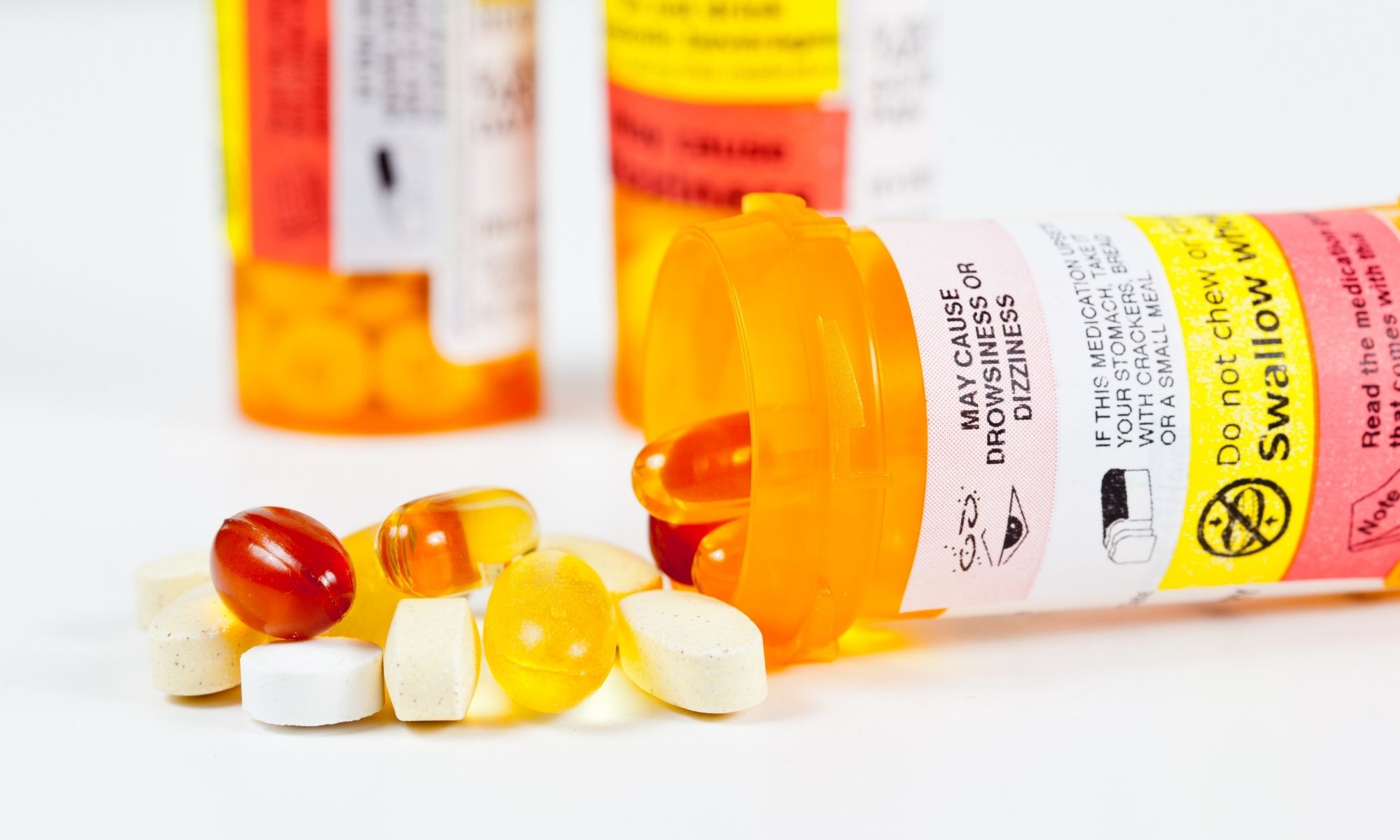
Use Contrasting Colors and Graphics
This is one of the least common design tips for a safer medication label. The colors and graphics may not contain the important information that patients need to follow, but they can certainly affect it. Color adds contrast in order to draw attention to certain details. This is why many headings and warning stickers include bright highlights. They can also be used to color-code specific details, such as a name or the type of medicine, which can help patients identify which medication is theirs or their family members’. This also can help differentiate medicines for patients who take several medications per day with different dosages. Many companies require their labels to use certain color-coding systems for these same reasons. Using a digital label printer is one of the best ways to produce medication labels and ensure their quality since they are equipped with some of the best color printing quality.
Clear Use of Drug Names
This is one of the first big tips that should always be followed. It might seem like it’s easier to fit everything onto the small label through using abbreviations of the medication names, but it could cause major problems. Most people who need to take prescription medications are not medical specialists. This means they will almost certainly not understand medical abbreviations. This could lead to confusion, leaving the patient questioning if they are reading about the correct medication. When the full name is written out, patients run a much lower risk of confusing medications and potentially taking something improperly. This is much more reassuring and user-friendly.
Omit the Salt from the Label
It is imperative that the salt of the chemical is not added to the label. Roughly 50 percent of all drug molecules used in medicine exist as salts, usually as hydrochloride, sodium, or sulfate salts. Many times, the salt is part of the drug because it helps the body to absorb the medication. This is why some medications, especially prescriptions, can have the salt added to the generic medication name. For example, a drug like the diabetes medication metformin hydrochloride is named the way it is because part of the drug is salt-based. The medication label should read only “metformin.” The salt should not be added to the label unless the drug contains multiple salts. It is further recommended that if the salt is to be listed, it should be listed after the medication name, never before it.
Include Both the Brand and Generic Name
It is important to print the brand name and its generic name on the label for specific reasons. The brand name will be the one that a specific pharmaceutical company has trademarked on the drug in order to sell it as their patented product. The generic name is the official name of the drug itself. For instance, the medication Tylenol is the branded name for the generic active ingredient acetaminophen. In the end, the two have the exact same active ingredients. For this reason, both can usually be printed. This helps to ensure that the patient knows that they have the correct medication. If it happens that state law prohibits printing the brand name when the indicated brand is not dispensed, it is best to print the brand name with “use for” in front of it.
