Your product labels play a significant role in attracting customers to your product. Creating a unique and inviting label design is a way to communicate to the consumer exactly what you want them to see. One of the key building blocks of a well-designed label is the proper use of color. Color can evoke many feelings in humans. It can help grab people’s attention and create the emotional response you need for them to become interested in the product. There are many ways to implement color to create the perfect label. Learn here, as we will discuss further how to use color in your product label.
Color for Symbolism
Among the many ways to utilize color when designing a product label, you should always consider the concept of color symbolism. Color symbolism is a part of color psychology. Different colors can evoke different emotions. When you apply this knowledge to the marketing world, you have a sense of what sort of labels will draw in customers for certain products. The wrong color for the label could create subconscious negative feelings, which would push people away from the product. It is helpful to understand what some of the most common colors represent. Red, for instance, sparks passion. It can even increase our metabolism, which helps stimulate our appetite. Orange creates a feeling of fun, and pink brings up feelings of love and nurturing. If we look at green, you think of nature and growth. Blue is associated with confidence and security. Black can conjure images of secrecy, elegance, and authority, while white often evokes purity and creativity. Consider what feelings you want to invoke in your customers when they see your product label, and match them with the appropriate color.
Mixing and Matching Colors
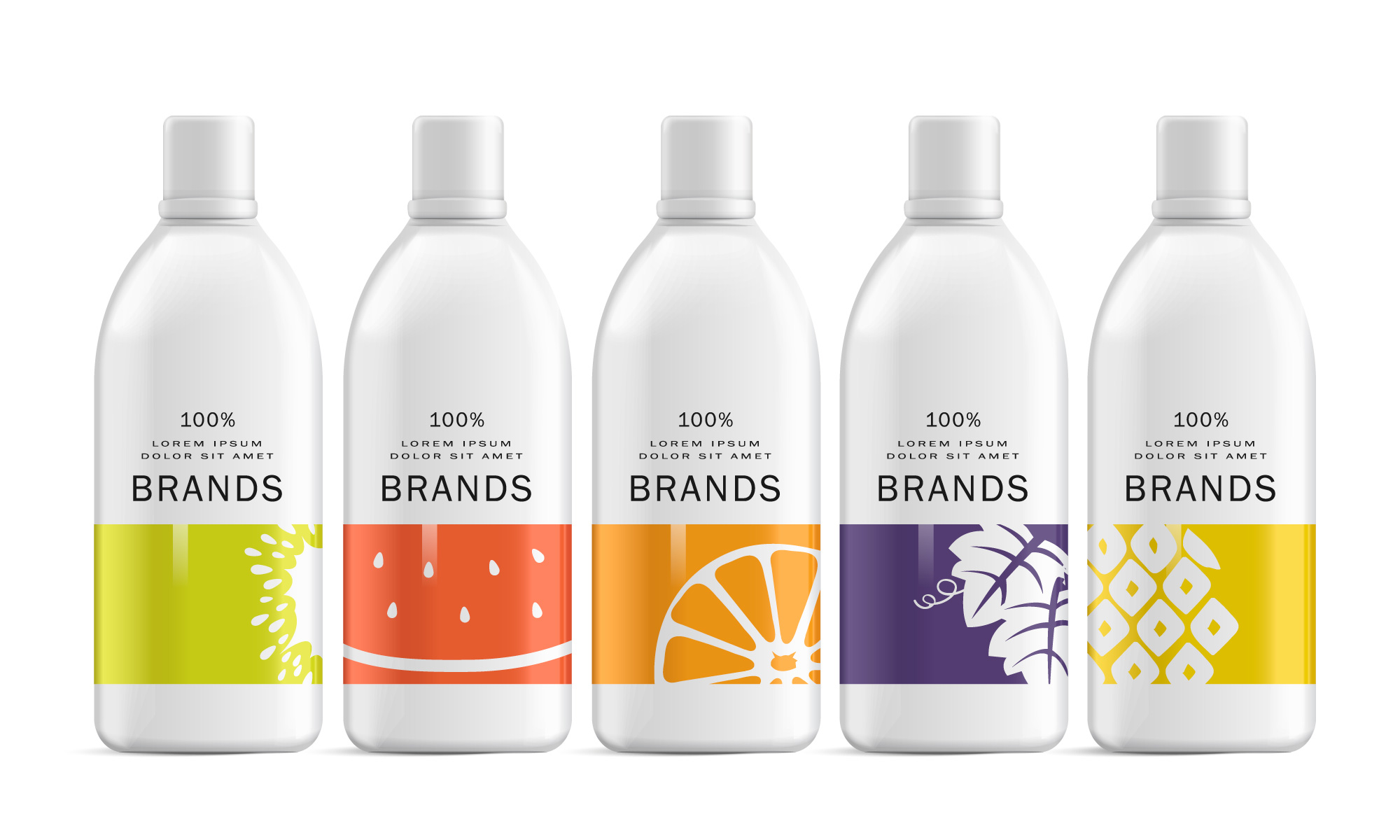
Special color wheels make a great guide for determining color choices. Complementary colors are the direct opposite of each other, yet these colors often go together quite well. If you want colors that could fade into each other, you need to look into analogous colors. First, think about your product, and remember the feelings you want people to have. Complementary colors can create a contrast, which will make certain elements pop out better on your label. The use of complementary colors can provide many advantages and help you include specific elements you want the customer to see. You do not want to overuse these matches, as they can become overwhelming. Analogous colors are great for flowing together, especially if you want to create relaxed visual images on your product labels. These colors have a subdued quality, which makes them great for developing labels focused on feelings of calm, harmony, and unity. Analogous colors are best used in the background of the image, especially for the sake of the text being highly visible in the design. Another trick that can be used with color pairing is utilizing what is known as the rule of threes. This rule refers to the theory that, people, primarily Americans, tend to see things in threes. This is rooted in our psychology and culture, as we tend to believe things in threes are funnier, more satisfying, and more effective. This rule can be applied to color combinations.
Paper and Material Colors
This is a very helpful tip to remember when wondering how to use color in your product labels. When you are designing a label, the colors in your design can be helpful, but you do not have to solely rely on them. Label materials can come in a variety of types and feature many materials that can assist in your overall label design. There are several unique types of label paper that could help you in designing your next successful product label. One option is pastel labels. Pastel label paper is created by taking a pure color and adding some white to it. The result is a lighter and paler version that is not as intense to the eye. These pastel colors can be used to evoke feelings of openness and lightheartedness in a product. They are often associated with femininity, which makes them common in cosmetic products, as well as items that are marketed for the spring. Metallic papers are a useful option if you want your product’s label to be eye-catching. The shiny quality usually looks best in silver or gold. Labels made of this material are generally suited for high-end products, as they represent sophistication and glamour. A great example of products that feature these types of labels are wines and other liquors. Fluorescent labels are great for a product that needs to stand out, but does not need to look extremely elegant. The neon look generated by this paper color is best if you want your product label to evoke upbeat, happy, and even loud feelings. Fluorescents can work with specific products, but their use should be limited so they do not make your brand feel too obnoxious.
Setting New Trends
One of the last things to know about using color with product labels is to try to be a trendsetter. Some of the most successful manufacturers are the ones that stayed one step ahead. Try different combinations that no one has attempted before. You can try implementing bursts of neon or pastels by using a label of a different color. Play with the design by changing the color palette from analogous colors to complementary colors. You can try a different font, or test a pattern and see if it gives the label a unique look. The key is to be creative. Color theory is its own science, but it also is not always written in stone. Make sure you are using a quality color label printer, which will ensure your final product will come out the way you envisioned. Remember to also check and see what other competitors are doing. Test out how your brand colors and designs compare. Also, try to stay up to date as much as possible. Keeping your packaging and labels trendy is imperative to drawing in consumers.