When creating the label and packaging for your product, many details figure into the effectiveness. One of these key details is the use of color. There are many ways color can communicate with the consumer. This means using the right colors to match your product will better market it. Learn about the impact of colors on product packaging by reading below.
Uses of Color for Product Labels
There are many ways color can be used to make a quality product label that furthers the success of your product. One of the keys to choosing the right colors is to start thinking about what your product is and the target audience. Think about the message you want to send to them. This will dictate the mood and overall feel that you want your product and its packaging to have when consumers see it. Color choice can be used to evoke many types of emotions. Your product will also be best represented by certain colors than others. You don’t want to choose colors that will clash with what’s inside the packaging. The colors on your product label are vital when it comes to good marketing. Each color has their own uses for varying types pf products.
Black
Black represents authority and luxury. Use black if you’re designing packaging for a product that’s meant to be on the high end of the market or want your product to have an element appeal. Interestingly, black can have a different effect depending where it’s being used in the world—it has many associations including trust, evil, and mourning to name a few. When sold in the right region, you can use it to evoke a feeling of power. Using black is important if you want to give consumers a feeling of empowerment.
White
Using white in your packaging label design can create feelings of purity, cleanliness, simplicity, and even new beginnings. To make your product convey it’s message simply, use white. White also represents a blank canvas which is great if you want to evoke thoughts of creativity. If you want to make a safer choice for the direction of your product packaging, white is wise choice. It also works well as a background color, especially if you want to have a bit more freedom with other colors and designs in your logo.
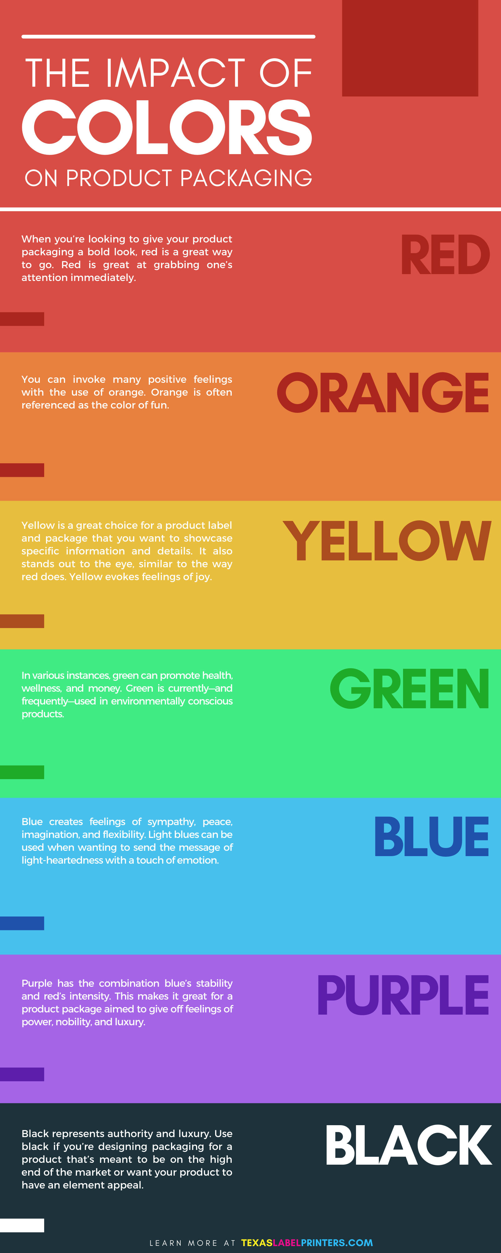
Red
When you’re looking to give your product packaging a bold look, red is a great way to go. Red is great at grabbing one’s attention immediately. Getting your target audience’s instant attention is something most product manufacturers strive for. This means that—as long as it won’t clash against the message you want your product to send—including some red in your product packaging design can’t hurt. Red has a unique benefit for food products in that it can actually increase one’s metabolism, which increases the appetite. If you sell food, designing your product packaging to get people hungry when they see it in the grocery store is a sure way to get them to buy it. Red also can be used to create feelings of passion and excitement. This makes it perfect for products marketed to be given as gifts to a loved one.
Orange
You can invoke many positive feelings with the use of orange. Orange is often referenced as the color of fun. There are many types of affordable products that tend to use orange. While statistics have shown that orange is one of the least popular colors among adult consumers, children happen to be very drawn to it. It’s bright, warm, and fun. This makes it a great color for marketing toys and other child-centered products. It can also be used to the benefit of food products and beverages. Orange has the advantage of evoking the energy of red and the joy of yellow since it’s made of the two.
Yellow
As one of the most prominent and visible colors on the color spectrum, yellow is a great choice for a product label and package that you want to showcase specific information and details. It also stands out to the eye, similar to the way red does. Yellow evokes feelings of joy. If you want the consumer to get great feelings of joy and feel they need your product, yellow packaging will help you. Consumers looking for positivity in a product will be drawn to yours. It’s great if your product is something lighthearted.
Green
When examining the impact of colors on product packaging, green is interesting to look at because of the variety of ways it can be used. In various instances, green can promote health, wellness, and money. Green is currently—and frequently—used in environmentally conscious products. This is because of its common connection with nature and freshness. Being “green”, after all, is a term used when being mindful of and caring for the environment.
Blue
When a company is looking to show the consumer that they value their trust, it’s a good idea for them to use blue in their product packaging and label designs. Blue creates feelings of sympathy, peace, imagination, and flexibility. Light blues can be used when wanting to send the message of light-heartedness with a touch of emotion. One more way to use blue on your labels and packaging is to appeal to those who value uniqueness and authenticity, as the color is often connect with these as well.
Purple
Imagination is one of the major ideas purple can invoke in consumers. Other uses for purple are for products that are supposed to give off feelings of royalty and uniqueness. It generally attracts children and females. Purple has the combination blue’s stability and red’s intensity. This makes it great for a product package aimed to give off feelings of power, nobility, and luxury.
For the best quality of color in your product labels, look into a commercial color label printer from Texas Label Printers. Here you’ll find a wonderful assortment of such machines from the top brands in the industry.