We’ve provided quite a few tips and tricks for mastering the product label world. Whether it’s for your CBD products or your beer label, our guides provide you with the information you need.
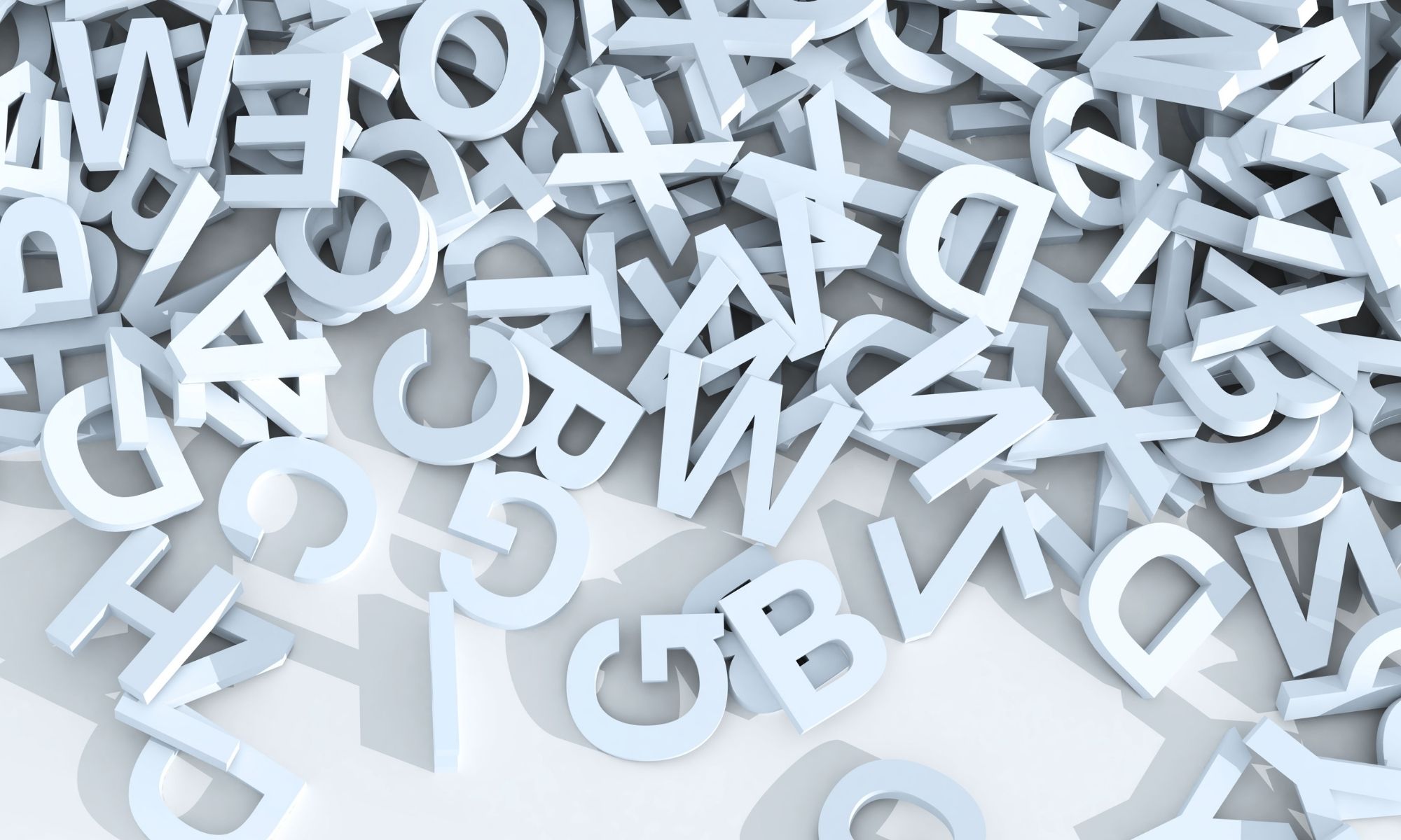
Now, in some of our past posts, we touched on typography and how that impacts a label’s presence and effectiveness. Below, we’ll delve deeper into some of the most legible fonts for your label. Before you choose, ensure you truly know the personality of your brand so that the label equates with who the company is. Once you’ve done that, explore the fonts discussed below!
First, Think About Serif or Sans Serif
Most fonts fall into two main categories: serif or sans serif. Depending on the size of the label and the personality of your brand, this choice will make an impact. Simply put:
- Serif fonts have “feet,” meaning the letters have perpendicular lines capping them off. They create a line for the eye, often making them easier to read.
- Sans Serif means that the fonts don’t have “feet.” It simplifies the text overall, making them read more modern.
A Few of the Most Legible Fonts for Your Label
Georgia
Georgia is a popular serif font for labels. It’s simple, yet refined, and can work for a variety of brand personalities. Even if your brand is a bit more bubbly, you can always go with a more robust font for part of the label and then use Georgia for the rest so the label has variety and uniqueness without losing readability.
Helvetica
Helvetica stands the test of time along with Georgia. The only difference is that it’s sans-serif and a bit less bold. That said, it’s one of the most easily read fonts, so it’s a good one if you have a lot of information to include on your label.
Rooney
If your brand is particularly upbeat and fun, then Rooney is a good choice. It’s bubbly, but still very readable. With rounded shapes and soft curves, this font will give customers an impression of warmth and connection. Not to mention, since it’s a serif font, you’ll still have a bit of class!
Garamond
Often used in the world of book printing, this could also be a good font choice for your label. Garamond is a serif font that stands up against Georgia, Times New Roman, and the like, so if those other options don’t speak to your brand’s personality, this one might.
Open Sans
Another very readable sans-serif font is Open Sans. Part of what makes this one such a legible choice is the amount of space—”kerning”—between characters. This makes it easy on the eyes, especially if used in a small size. It’s a good choice if you’re looking for something more modern without being stuffy.
These are just a few of the many legible fonts out in the world. Do some perusing, don’t be afraid to mix and match, and always keep your brand personality at the top of your mind. Once you’re ready for printing, make sure to turn to Texas Label Printers—our digital label printers will pass the label test with flying colors. Take a look!