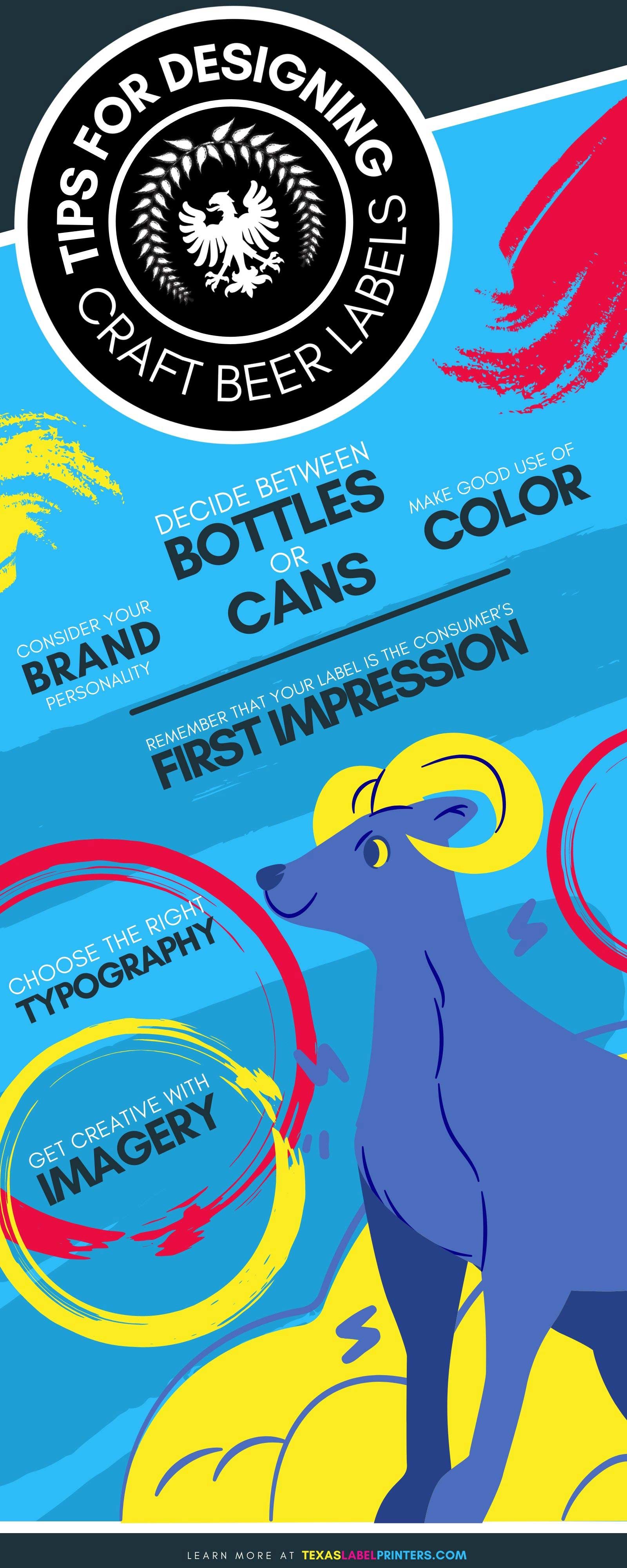
If you’re creating a new craft beer, you’re going to be up against some high competition, as the market for these beverages has exploded over the last several years. Designing the right label for your beer can be the perfect way to market it and make it stand apart from all the others. There are several elements that make a good beer label. Learn some tips for designing craft beer labels by reading below.
Consider Your Brand Personality
Before you even start to design the label for your craft beer, you need to consider a very important detail—your product’s brand personality. This means you need to think about the direction in which your beer’s marketing is aimed. This means asking questions such as, what is your product? Who is your target consumer? How will they be buying your product? Start by looking at what kind of beer you’re selling. Consider if it’s styled after another country’s style of beer. This will heavily affect the style and the personality of it. From here, think about the kind of consumer that will be drawn to your product. You’re best to aim it at one demographic rather than trying to satisfy everyone. Many craft beers are aimed at young people looking for a fun evening. Consider if you want to sell to a music-going crowd, or maybe one that prefers fine art. Think also about if they’re likely to buy your beer at a local store or online. Will you sell it in cases or six-packs? All of these details will help determine your label design.
Decide Between Bottles or Cans
When selling any beer, it’s contained in bottles or cans, and some companies choose to sell it in both. Many may wonder which one’s better. The truth is, it really comes down to which you’d prefer. The type of containment you choose, though, should be considered when designing your label. Consider how the label you want to design will look on either of these two. If you are looking to give your craft beer’s packaging a high aesthetic, bottling is going to be the best option. You can choose either one, but you can never go wrong by sticking with a traditional beer bottle, which will work with most label designs.
Remember That Your Label is the Consumer’s First Impression
It’s going to be important to remember that your label needs to be able to give a quality first impression to your target consumer. There’s so much competition with many craft beers out on the market that it will be hard to build your notoriety completely via word of mouth or through free samples. Your product label is going to be what gives the consumer their first impression of your beer. You need to transfer your brand personality into a visual example, which should be seen in the graphics of your label. It must show the personality of the product, which will draw in the consumer.
Make Good Use of Color
If you want your beer label to jump out and draw in the consumer, one of the key components to have in your label design is a strong use of color. Not only do bright colors on a beer label make it look fun and attractive, but it can be used to a scientific advantage when it comes to the emotions of the consumer. Studies have shown that each color can spark specific emotions in people. This can be an easy marketing tactic to use so you can convey your brand through a quick glance. One thing you need to consider first, though, is the bottle’s color. The three general colors tend to be brown, clear, and green. Green bottles generally get paired with black and white labels, sometimes with a touch of red. Brown bottles work best with any color because of they create a neutral background for the label. Consider using specific color schemes for the feel you want. For instance, a combination of oranges, golds, and red can create a feel that’s a throwback to beers of the past. If you want to be more modern and artsy, consider an alternative color scheme. A clear bottle means your beer’s actual color will become the label’s background. Consider a label color that matches or contrasts with your beer’s color if you use clear bottles.
Choose the Right Typography
Another one of our important tips for designing craft beer labels is to use the typography to your advantage. The style of typography you choose can give your label much of its personality. Remember—it should match with your choice of graphics. A classic style can be conveyed from a serif font. If you’re going for something wilder and new-age, consider a sans-serif font, which generally creates a modern look. You also need to make sure that your typography is legible. This includes the style and size. The consumer needs to be able to find all the necessary information, or else, they won’t trust in your product.
Get Creative With Imagery
Thinking about what you can do with your imagery is a very important part of creating a label for your craft beer, but it can also be one of the more fun steps. The logo or image you come up with is going to be the main detail that your target consumer sees and which draws them to your beer. This is where you once again need to consider your brand image. If you want to be clever, you might want to use something specific like a real person, place, or object. Craft beers have made use of popular people from history, popular characters, and even cartoons. You could also use a phrase and create an original image to represent it. You could also go completely abstract if your target audience is younger and into things that are more experimental. Just make sure to keep the consumer in mind.
To ensure you get the best quality product label for your craft beer, visit Texas Label Printers. Here you will find quality machines like Epson color label printers and other similar quality printers from some of the top brands in the industry.